
css3属性实现三维圆周效果
时间:6年前 阅读:8267
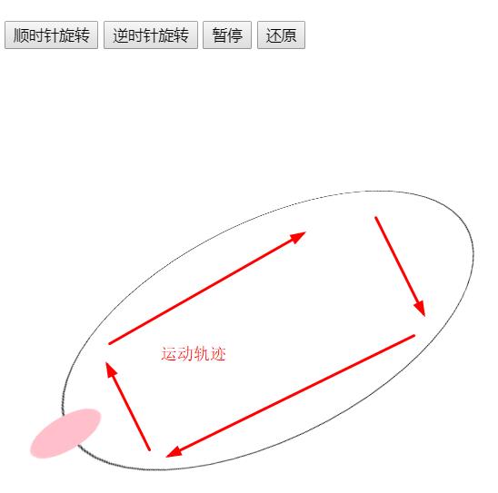
其实css3中提供了很多让我们实现非常炫酷的工具,好多特效不需要通过复杂的js代码来实现,而可以通过简单的css3代码来实现,这一次我就给大家介绍一下非常漂亮的CSS3制作的三维圆周效果代码,喜欢的朋友学习收藏下来吧。
<!DOCTYPE html>
<html>
	<head>
		<meta charset="UTF-8">
    <title></title>
<style>
	body {
    		margin-top: 100px;
    	}
@keyframes rotate1{
    100%{transform:rotateX(60deg) rotate(360deg);}
}
@keyframes rotate2{
    100%{transform:rotateX(60deg) rotate(-360deg);}
}
body{
    perspective: 700px;
}
#backup{
    height: 298px;width:298px;border:1px solid black;border-radius:50%;position:absolute;top:100px;left:100px;transform:rotateX(60deg) rotate(0);
}
#test{
    height: 40px;width: 40px;background-color:pink;position:relative;left:130px;top:280px;border-radius:50%
}
</style>
</head>
<body>
<button id="btn1">顺时针旋转</button>
<button id="btn2">逆时针旋转</button>
<button id="btn3">暂停</button>
<button id="reset">还原</button>
<div id="result"></div>
<div id="backup">
    <div id="test"></div>
</div>
<script>
reset.onclick = function(){
    history.go();
}
btn1.onclick = function(){
    backup.style.animation= 'rotate1 4s infinite linear';
}
btn2.onclick = function(){
    backup.style.animation= 'rotate2 4s infinite linear';
}
btn3.onclick = function(){
    backup.style.animationPlayState = 'paused';
}
</script>
</body>
</html>
本站声明:网站内容来源于网络,如有侵权,请联系我们https://www.qiquanji.com,我们将及时处理。

微信扫码关注
更新实时通知
网友评论