
Bootstrap进度条之层叠进度条
时间:8年前 阅读:6706
Bootstrap框架除了提供上述几种进度条之外,还提供了一种层叠进度条。层叠进度条可以将不同状态的进度条放置在一起,按水平方式排列把多个进度条放入同一个 .progress 中,使它们呈现堆叠的效果
<!DOCTYPE html>
<html>
	<head>
		<meta charset="UTF-8">
		<title></title>
		<style type="text/css">
			.progress {
  height: 20px;
  margin-bottom: 20px;
  overflow: hidden;
  background-color: #f5f5f5;
  border-radius: 4px;
  -webkit-box-shadow: inset 0 1px 2px rgba(0, 0, 0, .1);
          box-shadow: inset 0 1px 2px rgba(0, 0, 0, .1);
}
.progress-bar {
  float: left;
  width: 0;
  height: 100%;
  font-size: 12px;
  line-height: 20px;
  color: #fff;
  text-align: center;
  background-color: #428bca;
  -webkit-box-shadow: inset 0 -1px 0 rgba(0, 0, 0, .15);
          box-shadow: inset 0 -1px 0 rgba(0, 0, 0, .15);
  -webkit-transition: width .6s ease;
          transition: width .6s ease;
}
.progress-bar-success{
	background: darkmagenta;
}
.progress-bar-striped{
	background: darkcyan;
}
.progress-bar-danger{
	background: darkgreen;
}


		</style>
</head>
<body>
<div class="progress">
  <div class="progress-bar progress-bar-success" style="width: 35%">
    <span class="sr-only">35% 第一</span>
  </div>
  <div class="progress-bar progress-bar-warning progress-bar-striped" style="width: 20%">
    <span class="sr-only">20% 第二</span>
  </div>
  <div class="progress-bar progress-bar-danger" style="width: 10%">
    <span class="sr-only">10% 第三</span>
  </div>
</div>
</body>
</html>
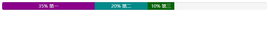
[注意]层叠的进度条之和不能大于100%
提示标签
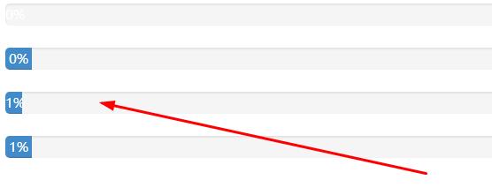
在实际开发中,有很多时候是需要在进度条中直接用相关的数值向用户传递完成的进度值,Bootstrap考虑了这种使用场景,只需要在进度条中添加需要的值
在展示很低的百分比时,如果需要让文本提示能够清晰可见,可以为进度条设置 min-width 属性
<!DOCTYPE html>
<html>
	<head>
		<meta charset="UTF-8">
		<title></title>
		<style type="text/css">
			.progress {
  height: 20px;
  margin-bottom: 20px;
  overflow: hidden;
  background-color: #f5f5f5;
  border-radius: 4px;
  -webkit-box-shadow: inset 0 1px 2px rgba(0, 0, 0, .1);
          box-shadow: inset 0 1px 2px rgba(0, 0, 0, .1);
}
.progress-bar {
  float: left;
  width: 0;
  height: 100%;
  font-size: 12px;
  line-height: 20px;
  color: #fff;
  text-align: center;
  background-color: #428bca;
  -webkit-box-shadow: inset 0 -1px 0 rgba(0, 0, 0, .15);
          box-shadow: inset 0 -1px 0 rgba(0, 0, 0, .15);
  -webkit-transition: width .6s ease;
          transition: width .6s ease;
}
		</style>
</head>
<body>
<div class="progress">
    <div class="progress-bar"  role="progressbar" aria-valuenow="20" aria-valuemin="0" aria-valuemax="100" style="width:0%">0%</div>
</div>
<div class="progress">
    <div class="progress-bar"  role="progressbar" aria-valuenow="20" aria-valuemin="0" aria-valuemax="100" style="min-width: 2em;">0%</div>
</div>
<div class="progress">
    <div class="progress-bar"  role="progressbar" aria-valuenow="20" aria-valuemin="0" aria-valuemax="100" style="width:1%">1%</div>
</div>
<div class="progress">
    <div class="progress-bar"  role="progressbar" aria-valuenow="20" aria-valuemin="0" aria-valuemax="100" style="min-width: 2em;">1%</div>
</div>
</body>
</html>
本站声明:网站内容来源于网络,如有侵权,请联系我们https://www.qiquanji.com,我们将及时处理。

微信扫码关注
更新实时通知
网友评论