
css文字融合效果
时间:7年前 阅读:6888
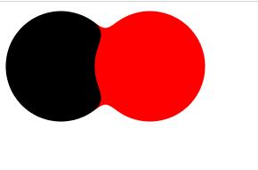
模糊滤镜叠加对比度滤镜可以产生融合效果
[注意]文字融合的思路来自chokcoco的博文CSS滤镜技巧与细节
1、模糊滤镜filter: blur(): 给图像设置高斯模糊效果
2、对比度滤镜filter: contrast(): 调整图像的对比度
当它们同时使用时,产生了奇妙的融合现象,通过对比度滤镜把高斯模糊的模糊边缘给隐藏,利用高斯模糊实现融合效果
例子:
<!DOCTYPE html>
<html>
<head>
    <meta charset="UTF-8">
    <title></title>
    <style type="text/css">
.box{filter: contrast(20);background: #fff;overflow: hidden;}
.left,.right{float: left;width: 100px;height: 100px;border-radius: 50%;filter: blur(6px);}
.left{background-color: black;}
.right{background-color: red;margin-left:-20px;}
</style>
</head>
<body>
	<div class="box">
    <div class="left"></div>
    <div class="right"></div>
</div>
</body>
</html>
为其中一个元素添加动画后,效果更明显
例子:
<!DOCTYPE html>
<html>
<head>
    <meta charset="UTF-8">
    <title></title>
    <style type="text/css">
.box{filter: contrast(20);background: #fff;overflow: hidden;padding:10px;}
.left,.right{display:inline-block;width: 100px;height: 100px;border-radius: 50%;filter: blur(6px);}
.left{background-color: black;position:absolute;left:0;animation: move 2s infinite alternate;}
@keyframes move{100%{left:250px;}}
.right{background-color: red;margin-left:120px;}
</style>
</head>
<body>
	<div class="box">
    <div class="left"></div>
    <div class="right"></div>
</div>
</body>
</html>
效果点上面的运行代码来看:

本站声明:网站内容来源于网络,如有侵权,请联系我们https://www.qiquanji.com,我们将及时处理。

微信扫码关注
更新实时通知
网友评论