
css实现两列布局 固定宽度和宽度自适应方法
时间:6年前 阅读:8624
不管是左是右,反正就是一边宽度固定,一边宽度自适应。
不少的很多主题也是这样设计的,一列固定宽度,另一列自适应屏幕的布局方式。
html代码:
<div id="wrap">
  <div id="sidebar" style="height:500px;background:red;color:#fff;">固定宽度区</div>
  <div id="content" style="height:500px;background:#000;color:#fff;">自适应区</div>
</div>
实现方式方式有如下几种:
1、固定宽度区浮动,自适应区不设宽度而设置 margin
我们以右侧宽度固定,左侧宽度自适应为例:
css代码:
#sidebar {
  float: right; width: 300px;
}#content {
  margin-right: 300px;
}
实现效果图:
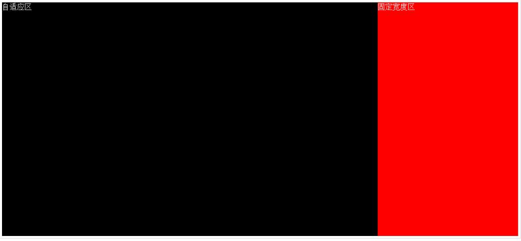
右侧一直固定不动,左侧根据屏幕的剩余大小自适应。
但实际上这个方法是有局限性的,那就是html结构中sidebar必须在content之前才行!
但我需要sidebar在content之后!因为我的content里面才是网页的主要内容,我不想主要内容反而排在次要内容后面。
那么上面讲解的第一种方法就无效了。
就需要下面的方法来实现。
2、float与margin配合使用
首先我们调整一下html结构:
<div id="wrap">
  <div id="content" style="height:500px;background:#000;color:#fff;">
    <div class="contentInner">
       自适应区    </div>
  </div>
  <div id="sidebar" style="height:500px;background:red;color:#fff;">固定宽度区</div></div>
css代码:
#content {
  margin-left: -300px; float: left; width: 100%;
}
#content .contentInner{
  margin-left:300px;
}
#sidebar {
  float: right; width: 300px;
}
这样实现,contentInner的实际宽度就是屏幕宽度-300px。
3、固定宽度区使用绝对定位,自适应区设置margin
html结构:
<div id="wrap">
  <div id="content" style="height:500px;background:#000;color:#fff;">我现在的结构是在前面</div>
  <div id="sidebar" style="height:500px;background:red;color:#fff;">固定宽度区</div>
</div>
css代码:
#wrap{
  position:relative;
}#content {
  margin-right:300px;
}#sidebar {
  position:absolute;
  width:300px;
  right:0;
  top:0;
}
4、使用display:table实现
html结构:
<div id="wrap">
  <div id="content" style="height:500px;background:#000;color:#fff;">我现在的结构是在前面</div>
  <div id="sidebar" style="height:500px;background:red;color:#fff;">固定宽度区</div></div>
css代码:
#wrap{
  display:table;
  width:100%;
}
#content {
  display:table-cell;
}
#sidebar {
 width:300px;
  display:table-cell;
}
当然最后一种方法在IE7以及以下浏览器不兼容,因为IE7设置display为table不识别。
本站声明:网站内容来源于网络,如有侵权,请联系我们https://www.qiquanji.com,我们将及时处理。

微信扫码关注
更新实时通知
网友评论